About Me

My photo
I'm an artist who can't choose a medium. My current weapon of choice is a black fine line art marker, which I use to doodle pretty little illustrations. I turn them into clip art that you can purchase in my Etsy shop for use in projects like web design and scrapbooking. I live with my husband and evil black cat in Chicago.
Showing posts with label fan art. Show all posts

Monday, August 15, 2011

Screen Printing

I have had a really busy day.  I went to JoAnn Fabrics, and spent far more than I intended to.  (It's those damn remnants.  I just can't resist!)  Then I walked home with my bag of goodies and proceeded to sew things.  I worked on a bag for myself - it's navy, red and awesome - and a houndstooth pattern quilted thing that I was going to use for a clutch, but the pattern is larger than I envisioned so I think I'll have to try again, and in between all of this I worked on my screen printing designs.

They are both fandom designs (and both spaceships... hm).  One of the Enterprise which says, 'Boldly Go', and the other is of the TARDIS and one of my favorite Eleven lines, 'Come along, Pond.'  And they both turned out so well!

My 'screen printing' method is more of a fancy stencil, but it's going to last longer.  This is how I did it:

You'll need:
  • small embroidery hoop (get the cheapest ones you can find)
  • sheer fabric (but woven tightly enough that it will hold the Mod Podge.  I got 'bridal organza' out of the remnant bin, and it worked perfectly for my fine detailed designs)
  • Mod Podge
  • tiny paintbrushes (your choice)
  • your black and white design printed to a size that fits well within your hoop
  • a fine point Sharpie
  • tape
  • light body acrylic fabric paint (I think it's actually used for air brushing)
  • a stiff bristled brush

Fit the sheer fabric in the embroidery hoop, cut off excess, but leave about an inch all the way around.  Tighten.

Put rolls of tape near top and bottom of your design, and press the hoop face side down onto the paper.  The tape is just there to hold it in place while you draw.

Trace your design with the Sharpie.  I like to stay inside the lines, that way I know exactly how far my Mod Podge should go.  Be patient and do this part right.  It will make the painting easier.

Remove paper design and tape from hoop.  Mod Podge all the areas of your design that you don't want to be screen printed.  This is where fine tip paint brushes come in handy.  I found it helped to hold my hoop towards a light.  That way I could see the little holes I'd missed filling in, and it was easier to discern the edges.

Allow to dry.  You may need a second coat if you missed lots of holes the first time.

Choose your screen print color, and with your stiff bristled brush get some paint on your brush and tap off excess paint on your palette.  Apply brush in firm, short strokes to the bare areas of your design.  Do not use too much paint - it will seep.  When you feel the design is covered to your satisfaction (look at it from several directions in the light to see spots you missed (unless you're going for the weathered look, then just ignore me).  Carefully lift up the hoop.  Start with one side and keep lifting in that direction.  If you aren't careful your design will smudge.

And that's it! 

I started with the Enterprise.  I didn't have Mod Podge then, so I was using acrylic gel medium with some yellow paint mixed in so I could see where I'd painted already.  It worked, though I had to use two coats.  I was able to find Mod Podge at the grocery store (miracle!), and used it for the TARDIS.  The Mod Podge just worked better.  I only had to do one coat.

I'm going to use both of these designs to make little wristlets to start with.  (I love my TARDIS wristlet.  I've been taking it everywhere, and everything I need fits inside it - so I want more wristlets.)  I'll likely use my screen print designs on other things later.  I'm really pleased with how they turned out!  I will definitely be making more of them in the future.

(Note: I have no idea why the photograph looks like that. I must have done something weird while I was editing it.)

Wednesday, August 10, 2011

Harry Potter Ornaments

Harry Potter Ornaments

Today my project was to make Harry Potter themed ornaments.  As you can see I went all out.  (Not pictured is a Golden Snitch ornament, which is currently in the process of wing attachment via craft glue.  It's taking it's sweet time to dry.) 

The Gryffindor Crest has a raised lion on a crimson backdrop, surrounded by a fuzzy golden glow.

The Sorting Hat turned out awesome, though it's hard to tell in the photograph.  It looks like it's laughing!  And the patches add a sweet sort of charm to it.

The Lightning Bolt is simple, but I like it.  That is a lightning bolt with attitude.

Hedwig is my favorite.  I've made owls in this style in the past (remember my wedding cake toppers?), and I think it works really well here.

These were all made with polymer clay (Sculpey III), stuffed with aluminum foil when necessary, and the metal loops are made from parts of paper clips.

I'm going to sell these as a set on Etsy.  When I figure out how it works, and how to post things for sale, and what the heck I should charge, I'll put a link up.

Sunday, February 13, 2011

WIP: Rapunzel's Tower

WIP: Rapunzel's Tower
My husband is gone for the weekend, and when he's not around I get really bored and start crazy complicated art projects.  Like so.

I haven't seen Tangled yet, but ever since this picture of Rapunzel's tower was released I've loved every inch of it.  Yesterday, I was bored and sick of watching tv, so I decided that I'd make myself a small scale version of the tower to grace my pretty bookshelves.  I spent several hours making the base of the tower and I made a start on the top portion.  I did some more today, but I had to stop, because I bruised my palms.  I didn't even know this could happen!  But I guess rolling out clay over and over will do that.  So I'll have to wait until it doesn't hurt my hands to finish the rest. 

The tower is made of polymer clay (Sculpey III) and bamboo skewers made the skeleton.  I used crumpled aluminum foil to give the bricks texture, and the bamboo skewers were also used to give the 'plaster' texture.  I'm also planning uses for acrylic paint, toothpicks, clumps of aluminum foil, and paper clips.   And possibly beads and glue for the windows... I'm not sure if the idea I have is going to work yet...

Tuesday, November 30, 2010

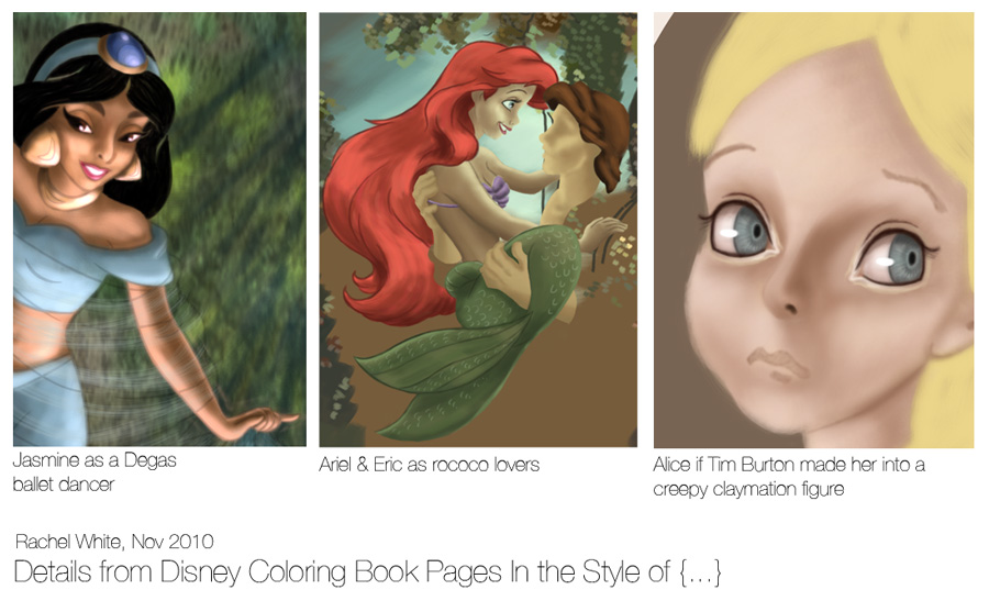
Disney Coloring Book Pages, WIP's


(Do I ever post anything that isn't a work in progress?)

All this time I thought that other digital painters must have some secret that they weren't sharing with me.  I thought I couldn't make the really pretty stuff because I didn't have the right program or whathaveyou, but it turns out I'm just stupid.  It's called 'Flow', and it's a brush setting in Photoshop, and all this time I thought it was just another way to say 'Opacity'.  It's not.  *facepalm*

I recently found a really amazing digital artist on Deviant Art.  Her painting style is just gorgeous.  It's all big brush strokes and texture, and I love it.  Anyway, I was going through her stuff and she wrote a bunch of FAQ/tutorial things, and one of them was what brushes she uses, and it was there I learned about 'Flow'.  So I've been trying to mimic her style all weekend to figure out how she does it.  So far I'm an epic fail.  I see chunky brush strokes and my brain goes, 'Gah!  Soft edged brush now!  Smooth that out!'  So that part isn't going very well, but I'm learning stuff through failure, which is a plus.

I've been trying things out using the painting exercise shown above.  You take a Disney coloring book page - Choose your favorite princess! - and you paint it in the style of some work of art.  It's fun and pretty silly, but I've seen it done with impressive results.

I started out this exercise with Jasmine, as I attempted to turn her into a Degas ballet dancer (in the coloring book page she's holding this length of sheer fabric, and I thought it might work), but my digital painting skillz aren't up to imitating Degas, so I gave up.

I moved onto Ariel and Eric.  I'm painting them in the rococo style (you can see the painting I'm drawing from here: Francois Boucher's Venus Consoling Love), because this pose screams 'rococo' to me.  I'm actually really excited about this one.  I don't think it's very accurate as far as being rococo goes, but I think it might turn into a cartoonish version of it.  And anyway, Ariel's hair looks fantastic.

I only started on Alice this morning, because I wanted to try the eye thing.  She's going to be the creepiest version of Alice I've ever seen.  The only part of her that's 'done' is her eyeballs, though I think I need to make the inner part of her irises darker...  But she'll be fantastic and weird when I'm through.